For those who would like to give the colors of their home a "face lift", here's an eye candy for you.
Monochromatic Color Scheme
A monochromatic scheme uses different values (tints, shades, tones) of only one colour, with the possible addition of white, black, and grey. Monochromatic schemes are easy to get right and can be very effective.
Monochromatic schemes with large white areas give a fresh, serene look – e.g. white walls and ceiling, bleached timber floor, and furniture in variations of the same colour.
Cool monochromatic schemes are soothing and peaceful, and make rooms appear larger than they really are. Use different values – from light to dark – to create interest and give depth to the interior.
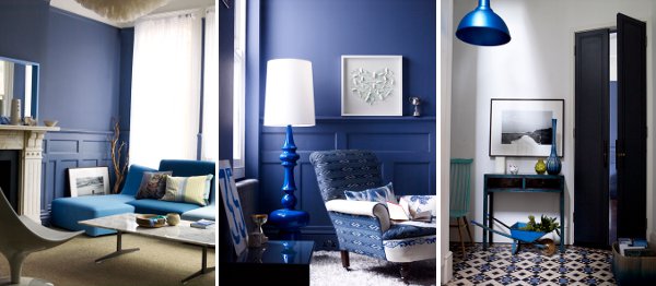
Warm monochromatic schemes are energetic and vibrant, and have more visual weight than cool schemes. Add white to make the scheme lighter.
Use neutrals (grey, off-whites) with light pastels to create calm, airy interiors.
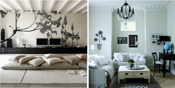
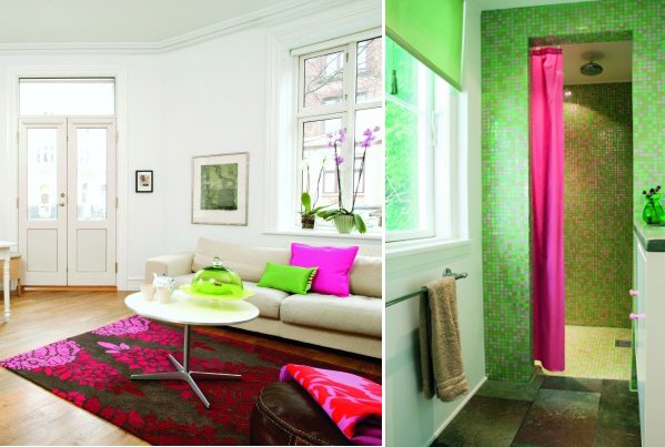
Use black, white and grey to create elegant, calming interiors. Any color that you introduce in a black and white interior will draw the eye and add interest.
Analogous Color Schemes
Analogous colour schemes use 2-3 colours close to one another on the color wheel. Adjacent colours are naturally harmonious, and are usually more interesting than monochromatic schemes.
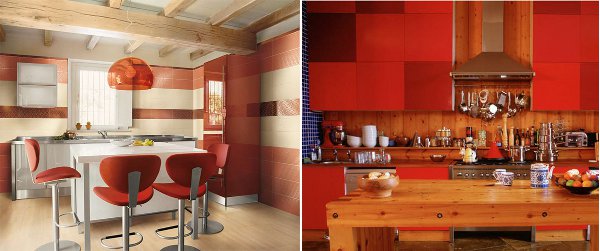
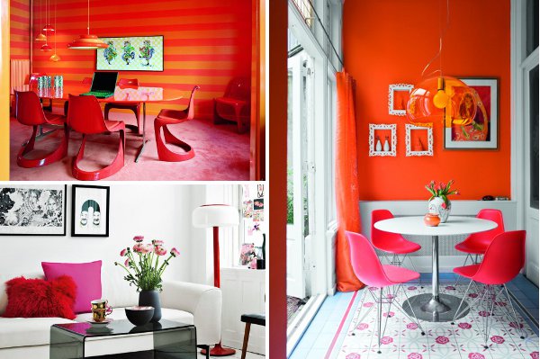
While cool colors are usually easy to live with, warm colors – especially red and orange – can feel overwhelming, both for their visual weight and for the energy they convey. If you like warm colors but want to retain tranquility, use them only as accents against a neutral background.
Complementary Color Scheme
Complementary colors are colors located opposite each other on the color wheel; when used together, they enhance and complete each other. In complementary color schemes, you usually choose one colour as your main color, and its opposite as an accent. For an elegant look, use a saturated color against a muted one; if you prefer bold schemes, choose intense colors against a neutral background.
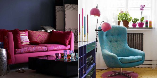
Triadic Color Scheme
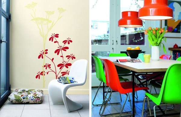
The triadic color scheme uses three colors equally spaced around the color wheel. Use this scheme if you want your room to offer both a strong visual contrast and a balanced, harmonious look. In the first picture, the triad consists of blue, magenta (red-purple) and yellow (gold in cushions and fabric). In the second picture, the yellowish pine flooring completes the triad blue – magenta – yellow.
Split-Complementary Color Scheme
A variation of the complementary scheme, the split-complementary scheme uses one color and the two colors adjacent to its complementary. Use it if you want to retain high contrast but prefer a more serene look.
Color schemes are meant to offer a guide, but don’t feel like you have to follow them too strictly. Sometimes you can choose variations of colors that are not exactly part of a color scheme, but still work well together.
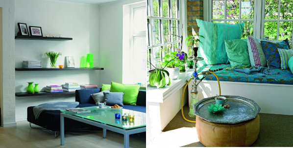
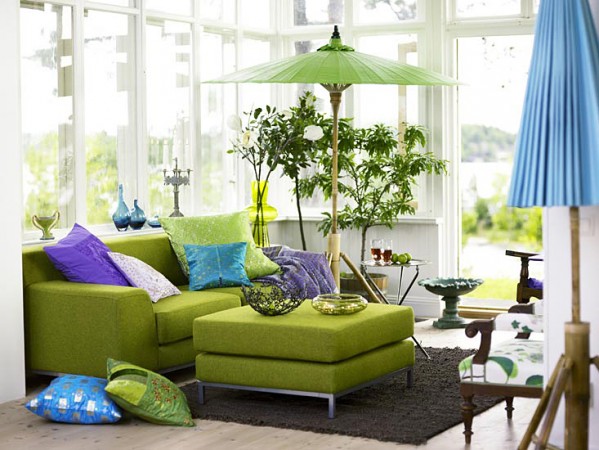
In this sitting area, green, blue and purple create a vibrant yet balanced combination – although not adjacent on the color wheel, the color used are still close enough to be harmonious.
In this sitting area, green, blue and purple create a vibrant yet balanced combination – although not adjacent on the color wheel, the color used are still close enough to be harmonious.
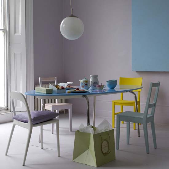
In this dining area, the yellow chair adds vibrancy to the delicate cool pastel colors; the scheme works well because all colors have light values.
When in doubt, take your inspiration from nature. A couple of examples? Lime green and orange are part of the same citrus family, and work really well together; purple and green are at home in a vineyard, and look striking in any interior.
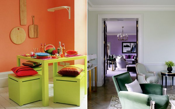
Photo and article source: Positivelybeauty.com


 RSS Feed